SBB
Swiss railway system
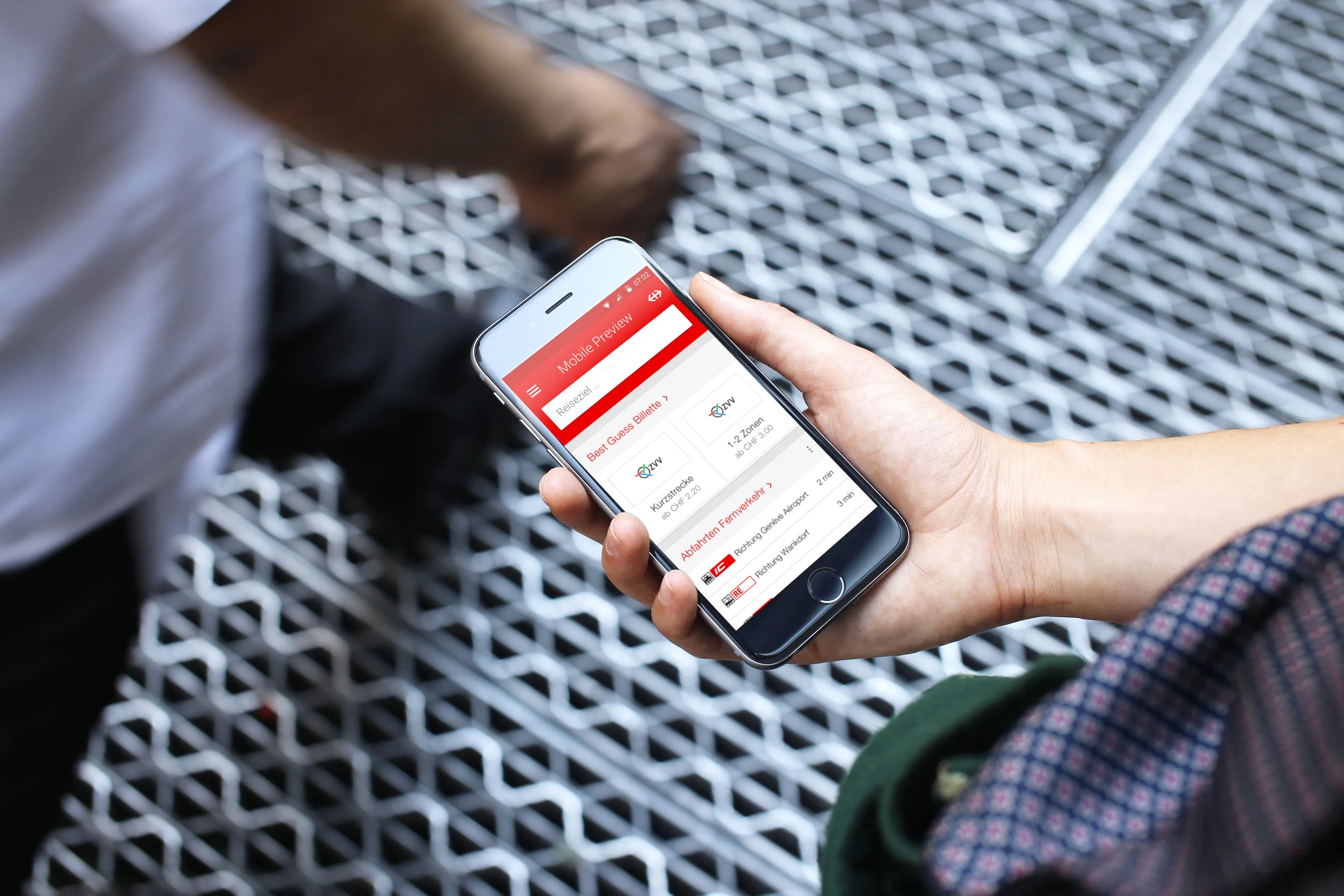
Swiss Rail System (SBB) transports 366 million passengers every year including commuters, weekend travellers and tourists. For eight weeks, I integrated an interdisciplinary team to design an interactive concept for the new SBB Mobile App.

Timeline of the concept project.
Defining guiding principles
The goal was clear but also wide, we would have to design for everyone and simplify the user flow, without losing the features people were already used to. As every good design is based on a solid foundation, the first step was to start defining key guiding principles.
The journey starts at home
The concept is here and now, the home displays information based on the need of a user depending on the moment and location.


The starting point is always home, no matter if the user wants to quickly search for a train, purchase a ticket or check detailed information. After completing the task, the user will always return home and begin the process again if he wants to perform another task.
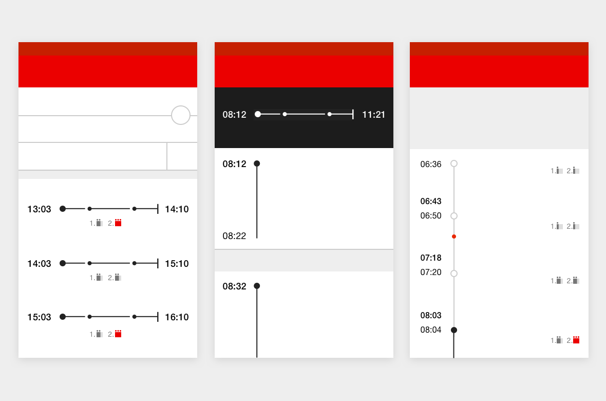
Optimizing time
In the old app, buying a ticket would take 11 taps and 50 seconds. Now, travellers reach the purchase screen in just two taps and 15 seconds.

Current implementation of the flow of buying a ticket.
Design for everyone
We knew we had to create a visual language that tells a story accessible to everyone regardless of age or ability.
The SBB visual language relies on design consistency of interface elements, visual hierarchy and data visualization. The result is a an application design adaptable for multiple platforms based in modern patterns for interaction that provides users with a simple and consistent interface while clearly communicating the SBB brand.
Visual language of the SBB mobile app.
Facts of success
Ginetta continued to play an essential role in shaping the final product throughout the implementation phase. For eight months, we worked on site in Bern as part of the project team until the initial release of the product at its public preview in November of 2015.
“It was very exciting to work so intensively in a project that concerns such a wide group of people. I learned a lot in this 8 weeks from user research to interface design, having the opportunity to think and execute a lot of different concepts.”