CARE - Extend your healthspan
CARE is on a journey to make preventive medicine accessible to everyone by providing comprehensive health check-ups, with digital access to all data in a mobile app combined with medical and AI recommendations.
Design & Product Strategy・UX/UI Design・Content Design・UX Writing・Market research
Digital Solutions
Website・Forms・Booking flow・Mobile app
Role
Senior Product Designer, 2024-2025

Design Challenge
I helped CARE transition to a digital-first company by applying a design thinking and product discovery mindset to enhance their user experience and lay a solid foundation for their business to scale.
Key contributions include:
Rethinking the core offering
Transitioning from a booking system to an e-commerce platform
Redesigning the website and establishing a new look & feel
Designing medical and lifestyle assessments
Optimizing the mobile app’s user experience and defining its future vision
Checkout the CARE Website and app or read the case study below.
Context
The CARE operational model
CARE launched in 2023 with an operational model focused on:
generating leads through in-person free consultations booked online, relying on high cost online marketing
acquiring customers by selling them Check-up memberships, drips and access to community events

Rethinking the core offering
In 2024, its main focus was to shift its operational model to become more profitable and resource-efficient:
by adopting an asset-light and digital-first approach
increase the number of leads and customers, while reducing marketing spent
increasing revenue and move towards profitability by establishing new partner locations, instead of growing the number of CARE stores
Research & Discovery
Understanding the problem
To kick-off the project, a gathered insights through customer satisfaction surveys and customer feedback from the store to identify how customers perceive the current offering, the services, and the brand.
Some key questions I aimed to answer:
What data do we have on what did/ didn’t in past CARE offerings?
What do customers value? What are opportunities to improve? What would they like to see at CARE?
Who are our current customers? Are there any patterns? What target group shall we aim for?
What do others do well that we can get inspired from?


Ideate & Prototype
Co-creating solutions
Offering workshop
Based on the research I led an offering workshop with the product team and co-founders to define the problem and ideate on the new offering packages to further test and iterate on.
Review insights and target group
Analyse and discuss current offering
Define “How Might We” solve the problem
Ideate new offering models
Prototype and group feedback

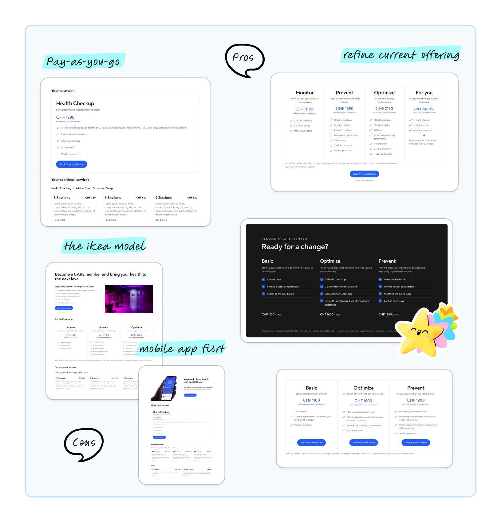
Design & Test
Fine-tuning the solutions to test
From the various ideas, we decided to test a refinement of the current offering tweaking it based on feedback over a 4-week period. I designed different views of the offering for the website pricing page and sales presentation.
The store team gathered feedback on how customers perceived these new offerings, which helped the product team iterate and get to the best performing offering.
UX Strategy & Content Design
UX driven additional health services
Alongside the core offering, I also ran a workshop with the medical team to restructure the additional tests CARE offered. While these services had a high revenue margin, they weren't selling well,
How do the existing additional services offering complements the Check-up?
What additional tests can we offer that make sense both medically and in terms of revenue? And which target groups would benefit from them?
I created the content strategy for add-ons across the website, app, and booking flow. Now, there’s a foundation for ongoing evolution, allowing anyone at CARE to start projects using these frameworks and the CMS.

✨ Checkout the Add-ons offering on the CARE website.
Iterating
Pivoting to a new offering
Although the new offering performed better than the old ones — especially with the combination of Check-ups and Add-ons — it was still heavily reliant on human resources, making it too costly for the output it generated.

Pricing wasn’t working with the current operational model
Too low for a human-dependent sales model but too high for an online check-out solution.
Online consultations weren’t performing
Hard to sell subscriptions, and up-sell add-ons: only 30% show rate and a 25% conversion rate.
Online Checkout
From traditional sales to a self-service model
The new pricing was the entry point to test a new fully digital sales solution — the online booking checkout.
Previously, people could only book a free consultation (new customers) or a service appointment (existing customers) and pay on-site. Now, they can instantly book and purchase CARE services online via both the website and the app.


✨ Checkout the booking flow online at the CARE website.
Solution
The new offering
During 3 months we tested the new offering, and kept adapting it according to the company operational model, customer feedback and profitability.
CARE now offers a service that is not only profitable for the company but also scalable to partner locations and aligns with the customer expectations. In a nutshell:
A base Check-up (only blood or full body)
A medical report
Access to the results digitally in the app
Optional add-ons: additional blood and cardio tests, treatements and lifestyle consultations


✨ Checkout the new offering on the CARE website.
Measuring success
Key insights from new offering performance
After 6 months of the new offering, we analyzed key metrics like marketing spend, highest-paying customers, CPL, and the stability of delivered revenue, revealing the following results:
91%
increase on number of analysis received, with a stable delivered revenue
65%
increase on sales performance since August, achieving in January the highest revenue since the start
< CHF 90
cost per lead, significantly lower compared to early 2024
5 partner locations
located in 4 different cantons, and expanding to 2 more in Spring
Setting a solid foundation
Redesigning the website and establishing a new look & feel
An important part of the success of this offering transition, was also the re-design of the website. Now that the offering and pricing were proving to work, it was time to redesign the rest of the website to match the new vision, reach the business goals, as well as be consistent with the new design — more clean and medical oriented.
Workshop
Description
Information architecture
From the workshop we prototyped 4 different offerings and laid down the pros and cons. These offering were tested in the next 4-6 weeks by redesigning the Pricing page on the website and the presentation in store.
Component library
To streamline the assembling of new pages in the future, a component library was created in collaboration with Miklos Barton.
At some point, the in-person sales consultations also moved to online consultations to increase the reach to people not located in Zurich and optimize resources.