
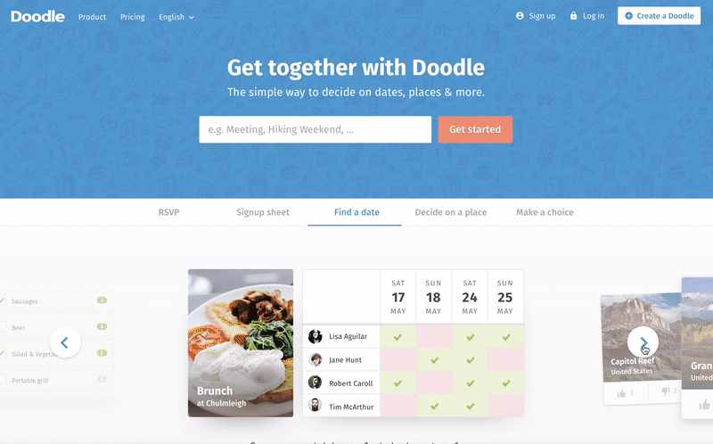
Doodle
Scheduling made easy
Since it’s release in 2003, Doodle has evolved as the most popular group scheduling tool on the internet, helping more than 1.5 million monthly users to find the best date for an event.
Time for a redesign
Doodle achieved market saturation in Switzerland and wanted to extend its reach to the rest of the world. Their main goals settle on grow private users and maintain premium users, along with increasing the number of polls, organic participation and revenue per participant.

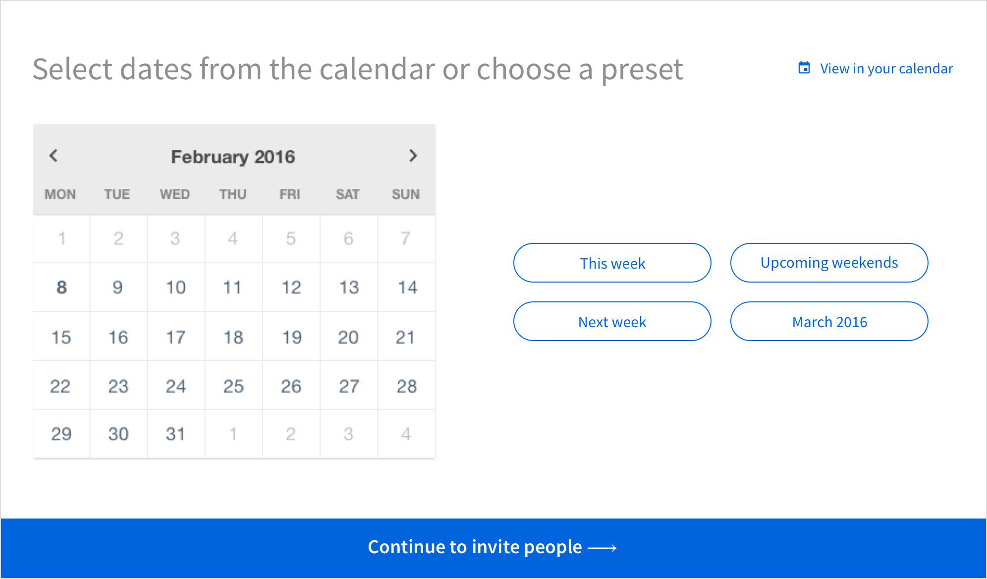
Doodle design until 2017.
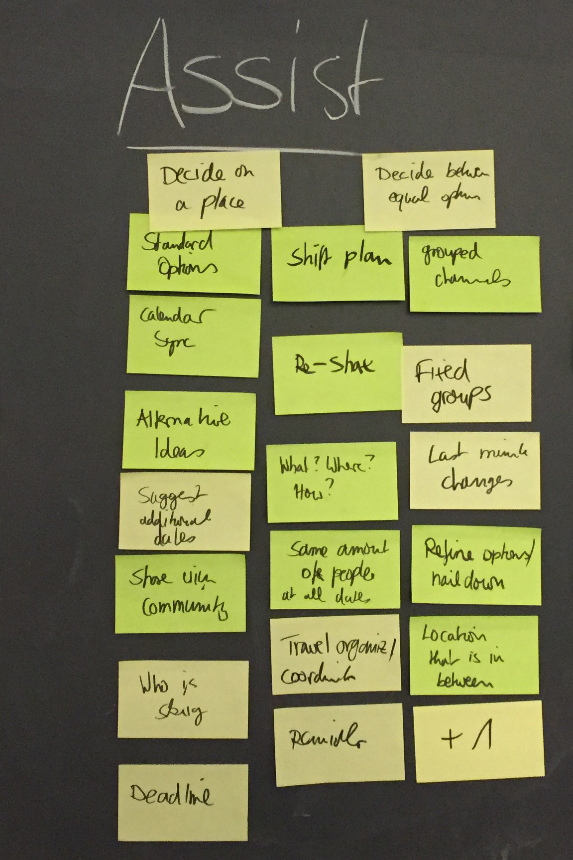
Collaboration strategy & process
Throughout the whole project, both teams regularly worked at the same office, which promoted a close collaboration and active knowledge sharing.
Our design process was based in a lot of sketching, static designs and several HTML prototypes. That helped to quickly test and validate ideas, as well as to communicate with the developers.
Design challenges
Several goals and pain-points had to be taken into consideration while designing the new website and web application for Doodle.
While Doodle works great for finding a date & time for an event, users always wanted to organise many other things in different ways. It became obvious that it had to be more clear what Doodle can be used for and turn hacks into features.
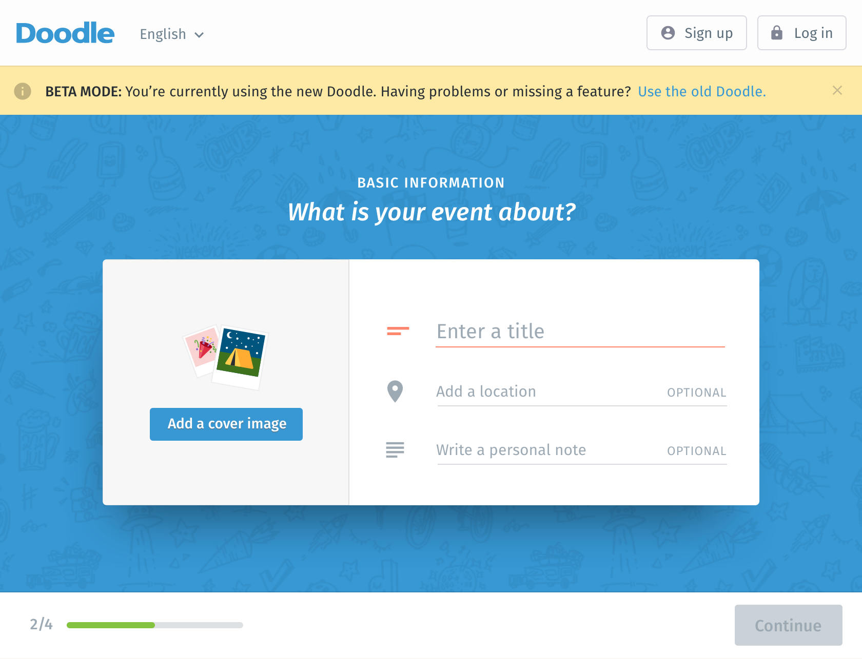
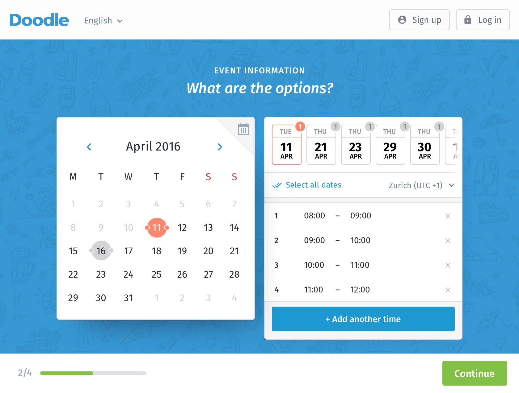
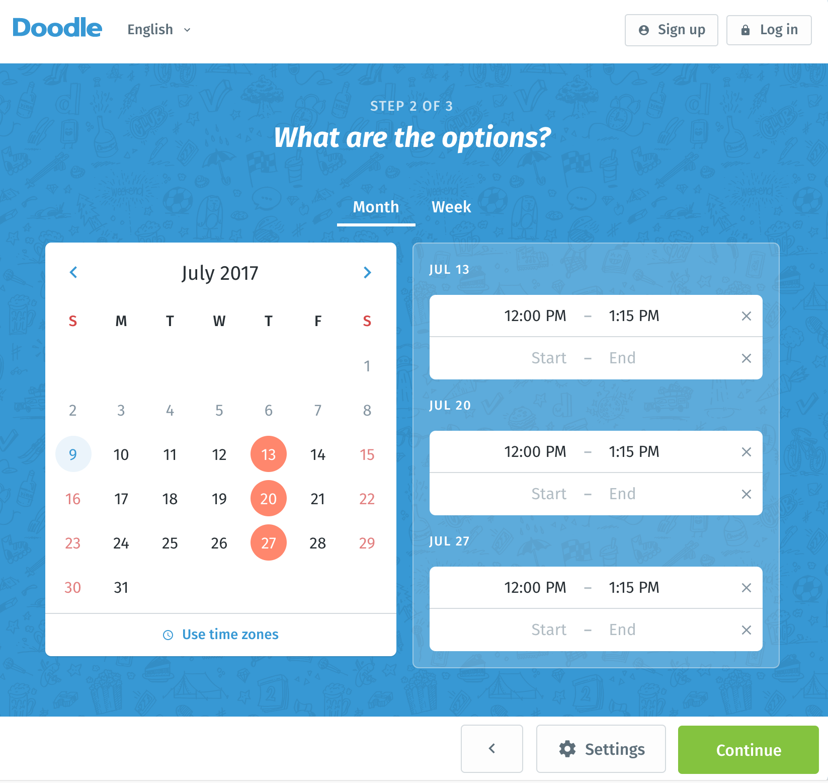
Less complexity
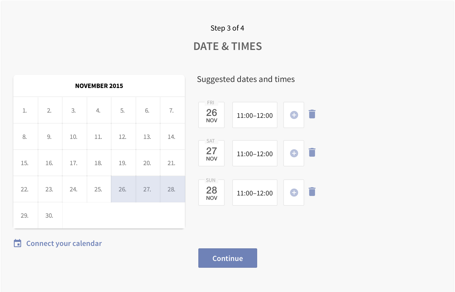
The “Create poll“ flow has now considerably less steps.

Flow: creating a new poll.
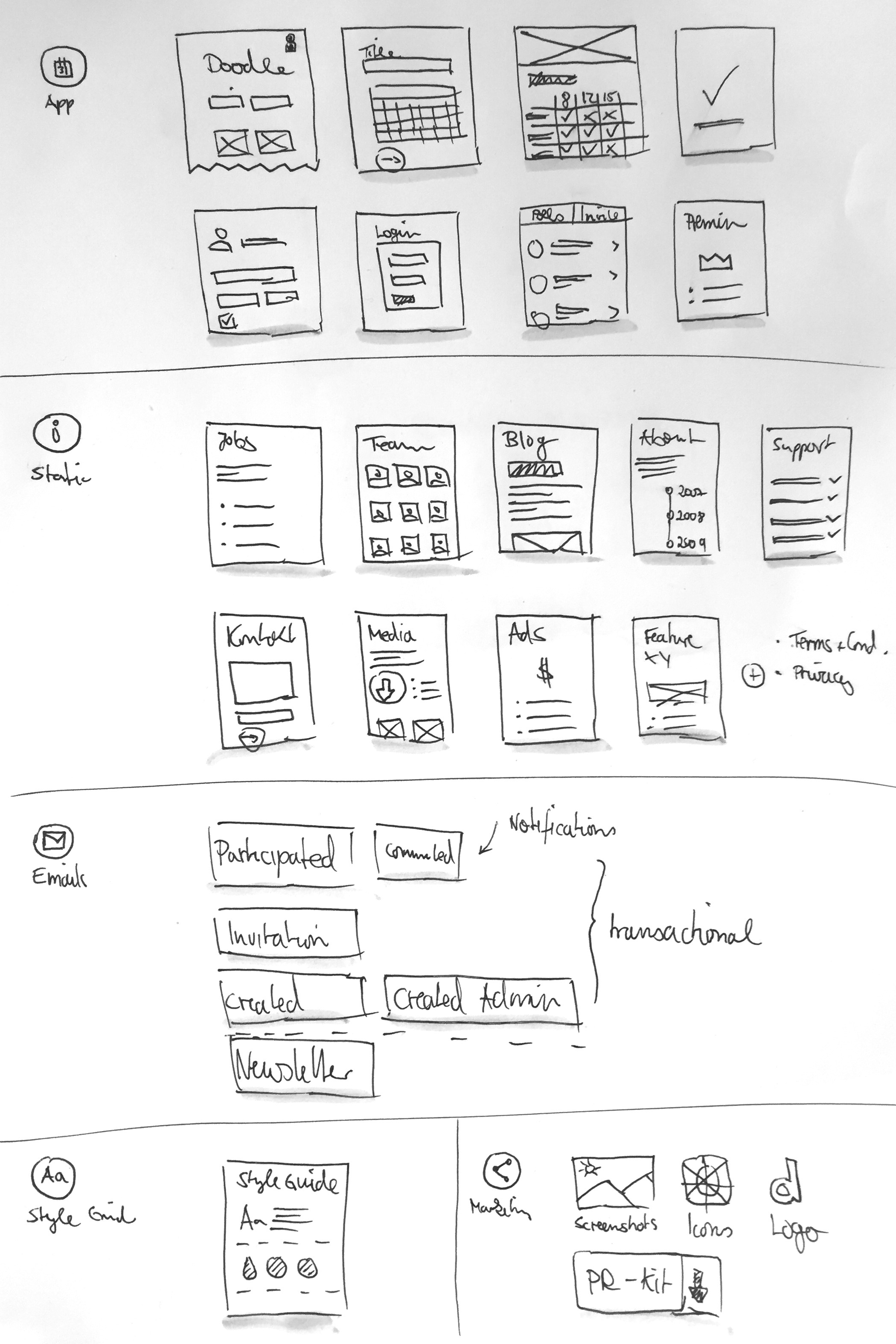
New use cases
Introduce three new use cases: signup sheet, decide on a place and make a choice.
Different use cases for Doodle.
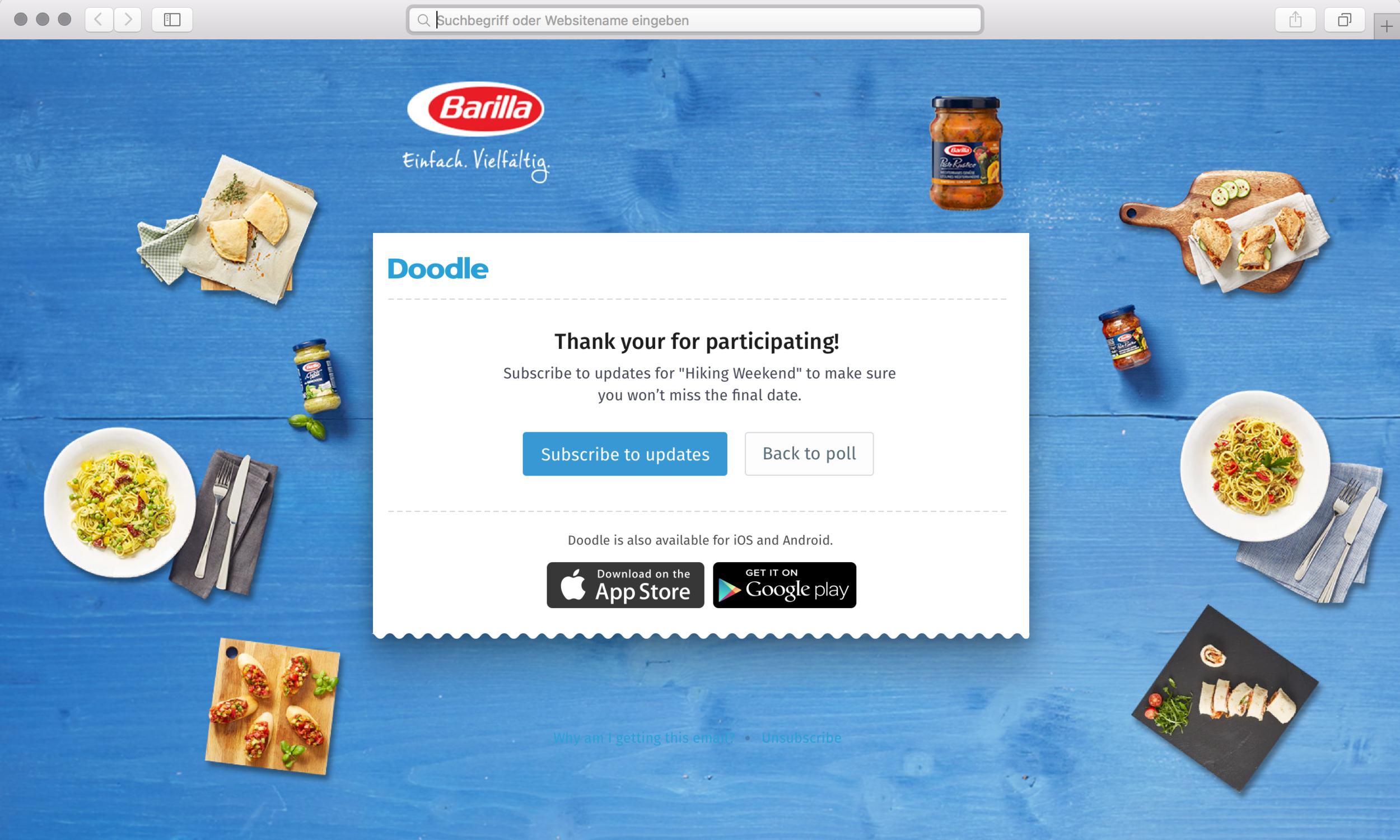
Evoke user engagement
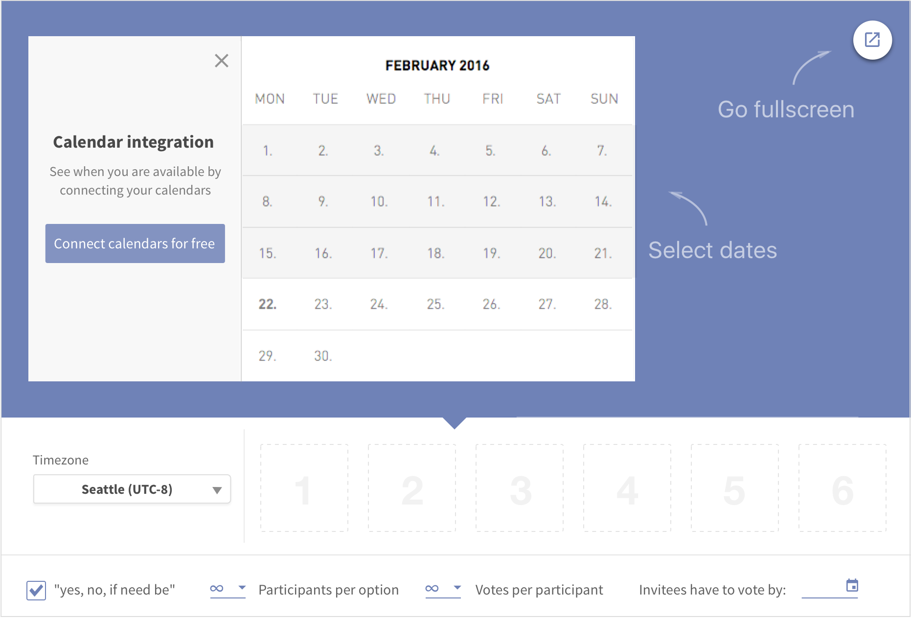
Include new features (e.g. add event cover image) to increase the time and effort the user puts in the product.
Example of engagement tactic: possibility of adding a cover image to the event.
Test it until you make it
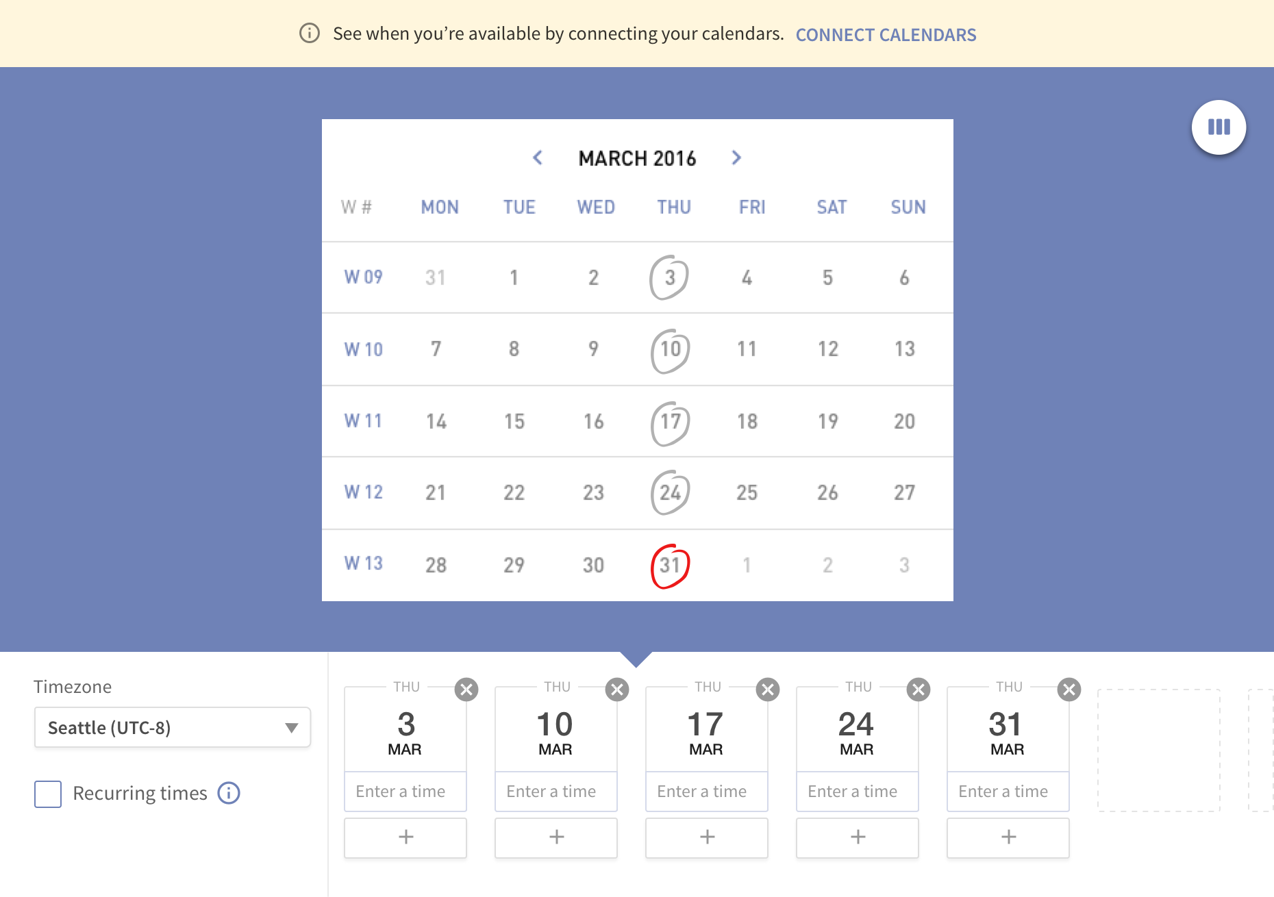
We knew that all the new ideas we’ve conceptualised would have to be verified with real users. We set up a testing environment at Doodle and conducted around five rounds of user-tests in total. We tested the prototype with existing users and new users from every age group, on-site and remotely. Below you can find several versions that were tested.
Advertise with class
Ads are crucial for the monetization of Doodle but they're also a source of distraction for the user, being responsible for a lot of opt-outs. We knew we had to keep it in the new design, which added restrictions and complexity to the process.
Our strategy was to integrate and combine the different existing ad types into the design, to keep a great user experience without losing ad revenue.
Example of an ad integration after the user participates in a poll.
Set consistency standards
In comparison to the Doodle native mobile apps, Doodle web had an outdated and uninviting design. Thus, it was necessary to create a consistent visual language across all platforms.
The new Doodle branding should be attractive, timeless and global. To reflect that, we created a vibrant, young and inviting design that relied not only on visual elements but also in several animations that served as a guidance for the user, strengthen the new Doodle brand.

Living style guide
At that time, Doodle design was based in legacy code (source code that relates to a no-longer supported or manufactured operating system). It had no style guide behind it, which made it hard to work with existing code or design elements. To improve this process, a new living style guide was created in close collaboration with the development team.

Example of the static style guide that later turned into a living style guide.
Facts of success
Doodle launched their new design in Spring 2017. The same design principles, methodologies and strategies are still followed by the Doodle team. They continued to work on the product by themselves, growing their team considerably.
“The use of html prototypes allowed to work fast and efficiently by testing different ideas in a short time. The close collaboration between both teams eliminated any work barriers.”